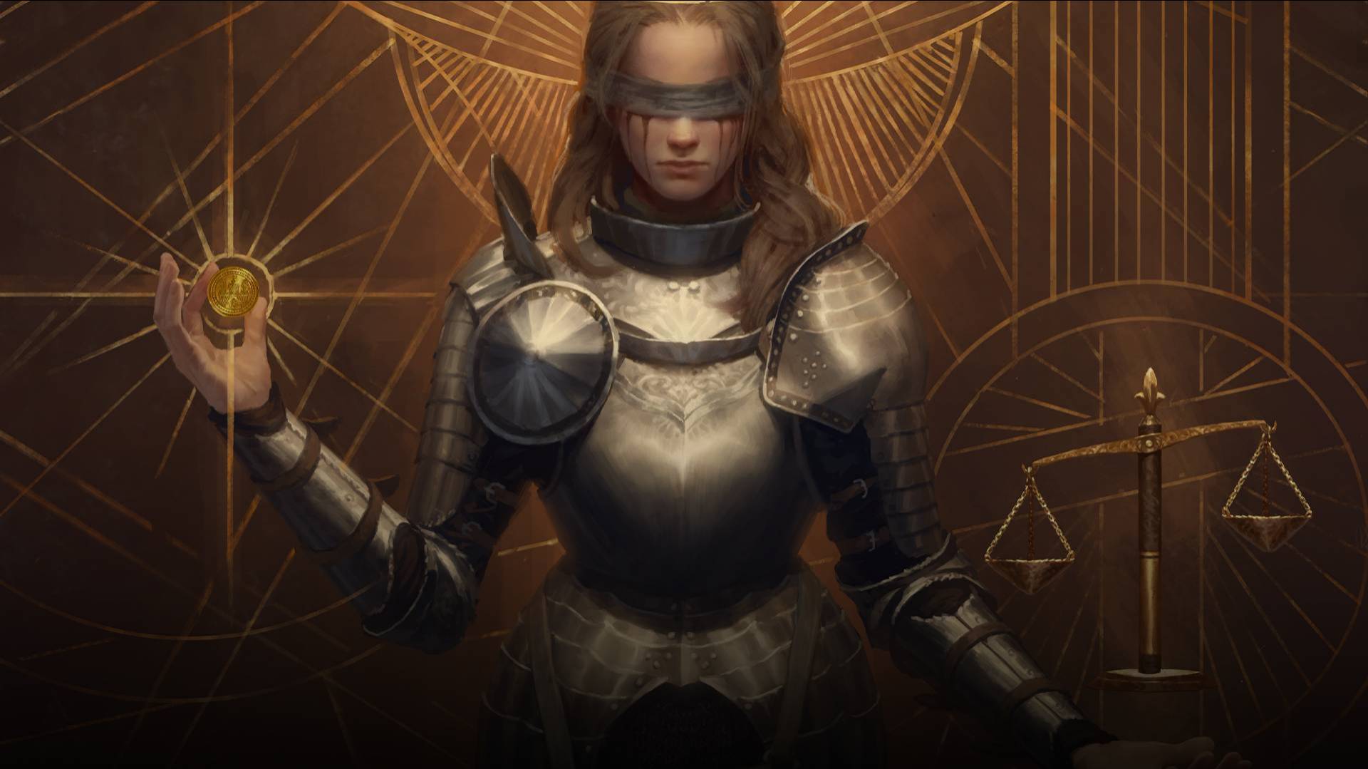
Welcome everyone! Today, we’re going to visit the artist’s desk and take a close look at how the art for one of the cards, “Glynnis aep Loernach”, was created. Our guide to show us the process behind it is none other than the artist himself – Lorenzo Mastroianni.
Can you tell us the story behind how this piece was made?
I remember that this illustration was done in a rush right before going on holiday. I knew that I didn't have as much time as I usually do for a card, so I decided to offer the team two sketches instead of the usual three – one of them being a rework of a card that was never released.

Which card are you referring to and what made you revisit it?
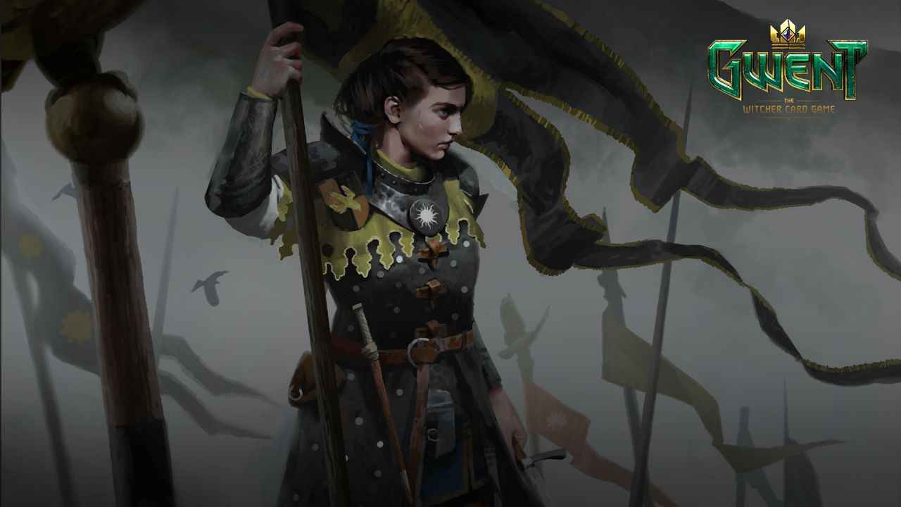
The card in question was an illustration of Queen Calanthe. I really liked the idea of the dead horse at the feet of the queen as a symbolic reminder of how war isn't about heroism and glory, but rather casualties and destruction. What I didn't like was the warm atmosphere, so I thought it was a perfect opportunity to further improve on an illustration that was never going to be used anyway.

Which sketch did you like the most?
To be completely honest, I was hoping that the second sketch would get chosen because I would only have to change the flag color, her armour and her face and I would be done with it!
But as you can guess, my team picked the other sketch and my laziness wasn’t rewarded in the end. Oh well – you can’t argue with democracy. Either way, both of the sketches still featured what I love to draw the most: a strong, armor-clad woman surrounded by flags.
What was the idea behind the character’s pose?
There is a running joke in the illustration team that I always favor sketches that feature a profile portrait. I fully admit this is a gimmick of mine that I never get bored of! The gaze of the character points to something far outside the frame, which makes you wonder what’s going on beyond the illustration. In general, it gives the character a rather melancholic look, which is definitely my kind of jam!
Can you tell us a bit about the character’s outfit?
I drew inspiration from a design sheet with gorgeous armor concepts done by Valeriy Vegera, so I simply used them as references for the forms and colors.

The idea behind these knights was simple: they are an elite unit of the Nilfgaardian army, predatorial in their speed and ruthlessness, and so their heraldry and overall triangular design is influenced by the sharp features of the peregrine falcon.
What did you find challenging about this illustration?
Hands are tricky and photo references always help. Funnily enough, I used my own hands as a reference. The photos that I take always have the same characteristics: I’m holding an item that is always absolutely unrelated to the picture and the look on my face is... very focused, to say the least, since I want to have interesting light and perfect readability of the fingers.

You mentioned that you had very little time to finish the illustration. How did you cope with that?
When you’re low on time as an illustrator, your best friend is the fog: it hides most details and gives a deliciously grim, epic feeling to any scene. I absolutely abused it in this illustration and made the background as simple as possible.

In the end I managed to finish it on time, but in the process this piece taught me one thing: it’s okay to not always set up new challenges for yourself. Sometimes it’s better to just do what you feel comfortable with, but at least get it done.
Is there anything you’d like to tell the community?
I would just like to say that the Gwent community’s enthusiasm toward our art makes us feel really proud of our work. Your continued support and appreciation matter a lot, so on behalf of the illustration team – thank you!